 It’s a blog party at Simon Says Stamp! We are celebrating crafting together – uniting as a community – to help us get through this pandemic called COVID-19. No matter what, our crafting will help us through these challenging times. If we can help inspire each other to enjoy our craft, art, hobby, we can help people get through this together. If we find things to do that help ease our mind and focus on something that brings joy, we will be able to manage through this difficult time easier. I hope I inspire you today.
Today, I’ve got two cards to share with you featuring Simon Says Stamp products. I tried a new color combination and fell in love with it as a I was working on it. I used citrine and aqua together with a few accent colors, too. I hope you like it!
To find more inspiration go to the Simon Says Blog for a list of designers featuring projects today. You can also go to Instagram and search on #SSSUnitedWeCraft and/or #SimonSaysStamp for more ideas and inspiration from your creative friends!
Card 1: Miss You Slimline Card
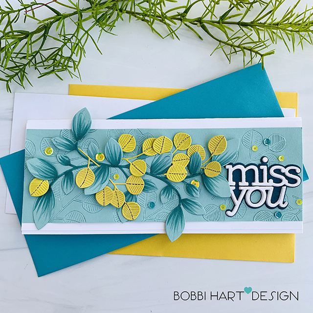
My first card features the following Simon Says Stamp products:
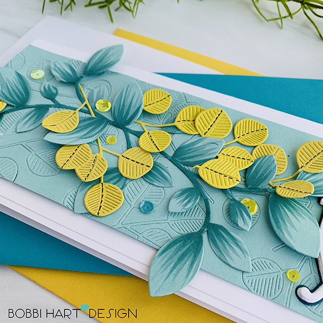
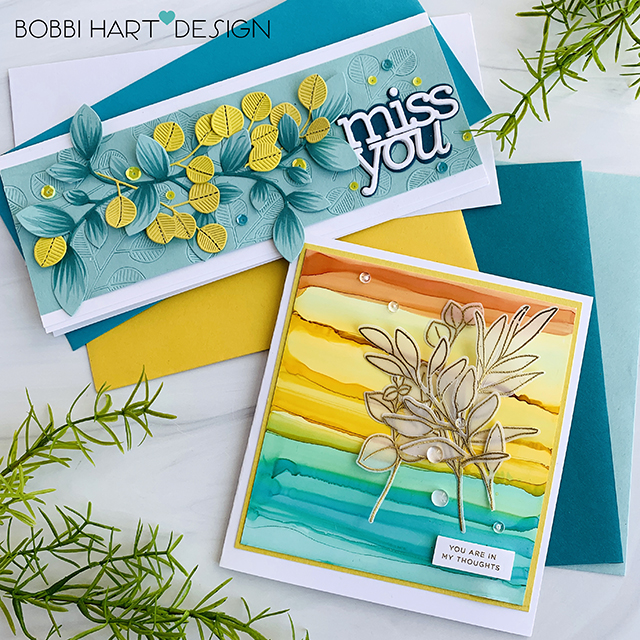
To create this card, I first ran the eucalyptus leaves die through my die cutting machine using a rubber mat in the cutting “sandwich” in order to create impressions (i.e., embossed images v. cuts) in the aqua background piece that measures 8-1/2″ wide X 2-1/2″ tall. Next, I die cut the leaves in citrine-colored cardstock and also die cut a clustered leaves design in the aqua cardstock. I added copic coloring to the leaves and stem for more contrast. I layered the leaves, added sequins in gold and teal and glue everything together using Gina K Connect Glue.
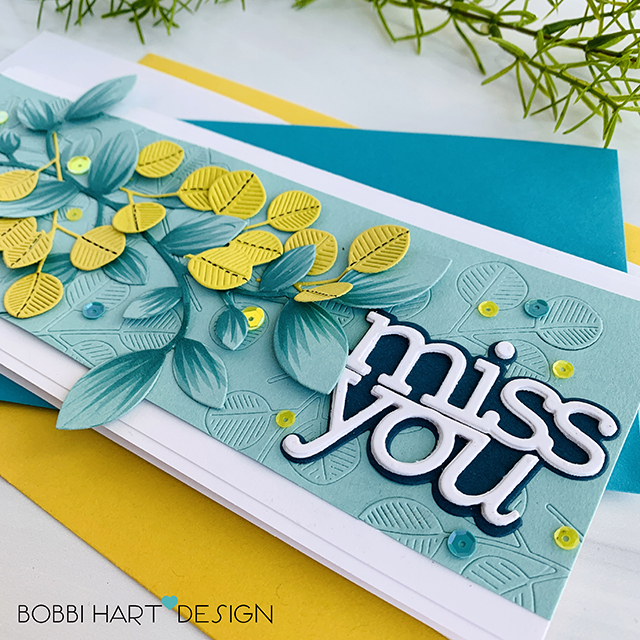
Next, I die cut three “miss you” cuts in white cardstock and one background in a navy color. I layered and glued them all together to create a dimensional phrase for the front. I placed it to the right of the leaves. I adhered the front to a white card base measuring 8-1/2″ wide X 3-1/2″ tall to complete this slimline card. This card fits perfectly into a business-sized envelope for mailing. I happened to have a citrine and a teal envie that matched perfectly. Yay!
Card 2: In My Thoughts
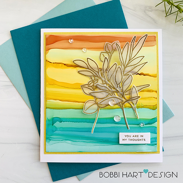
My second card features the following Simon Says Stamp products:
Be Kind stamp and die sets (combo set here)
CZ Design Everyday Clean Lines stamp set
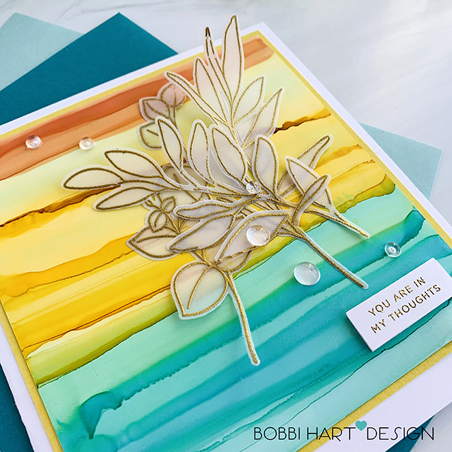
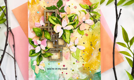
To create my second card, I used Ranger Alcohol Inks in Sunset Orange, Butterscotch, and Pool and Yupo paper to create the background. Yupo paper is a synthetic water-resistant paper. When used with watercolor or alcohol inks, your paint will dry only by evaporation and there will be no absorption by your paper (as would be with regular watercolor paper). I love using it because it feels like a plastic and presents beautiful colors when used with alcohol inks. It maintains the color intensity of the ink after it is dried.
To make the background, I simply added dots of ink in rows and then used an inexpensive small watercolor brush dipped in Isopropyl alcohol (available at Walgreens or Target) and ran the brush across the paper to create the horizontal ripples. The ink will create these amazing lines of color. The background should be set aside to dry completely before applying the embellishments.
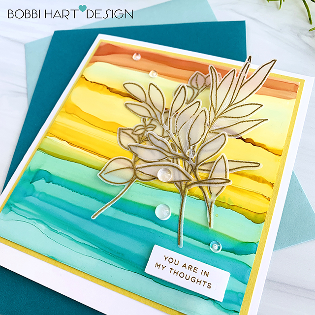
I stamped the Be Kind leaves in Versamark and heat embossed using metallic gold embossing powder on vellum paper. I die cut the foliage and added them to the front using Connect glue. I also heat embossed the phrase from Everyday Clean Lines on white and popped it up with 3M dimensional foam tape. Icy Crystals were added to the front as well as a citrine mat. The card front was attached to a 5″ X 5.75″ white card base to finish the card. This card fits in a 5″ X 7″ envelope for mailing. This is an easy to card to make in any size. Make your card to fit envelopes you already have!
Remember – To find more inspiration go to the Simon Says Blog for a list of designers featuring projects today. You can also go to Instagram and search on #SSSUnitedWeCraft and/or #SimonSaysStamp for more ideas and inspiration from your creative friends!
Want to see more ideas and inspiration from me? Subscribe to my blog, BobbiHartDesign.com.
I’ll send you updates on new posts!
You can also find me on Instagram as @BobbiHartDesign and on Facebook as BobbiHartDesign.
Bobbi Hartmann Lemanski,
Bobbi Hart♥ Design
Adding h♥art into every design






I love the alcohol ink background. I think I will try the stripe effect later today. I have plenty of supplies and plenty of time.
Hi Donna. So glad you stopped by. Yes, try it! I think we all have a little more time on our hands at home right now. I find I can spend a lot of time creating and watching Netflix in the background or listening to music while I work! Every time I use Alcohol inks, I enjoy them. The results are unique each time. I used Isopropyl Alcohol to move the ink. I added that piece of info later in the day to my post. Not sure when you read the blog, but I did add a few more details because I was getting questions on the process. Unfortunately, yesterday morning, 5 minutes before we were supposed to be “live,” WordPress decided to delete my draft post so I had to recreate it quickly and left out details of what I did just to get it published. Anyway, the alcohol helps make the stronger ripples in the look. Let me know if you have questions and have a great Sunday! Bobbi
Wow! your cards are amazing. Love them both! Beautiful colour combinations.
Pauline – Thanks so much! It’s so nice hear those comments. I really enjoyed making these. My goal was to try a new color combo that I have not tried. I had some papers sitting out and I looked over and thought – that’s my color combo for the day! I was drawn to the colors together. Thanks for stopping by and sharing. 🙂 Bobbi
These cards are just amazing. The colors remind me of an awesome ocean sunset. Turquoise and golden yellows and oranges. Just stunning!
Thanks, Karen! Yes, I love these colors, too! They speak to me. 🙂 I’m glad you like the cards! Bobbi
Love watching movies every morning !