Today’s cards were an exploration of color combinations. I wanted to try new color combos and see how they looked together. This is a fun exercise in challenging yourself to get out of your comfort zone. These are also cards to express gratitude. With Thanksgiving around the corner, sending a thank you or a note of gratitude just seems appropriate. For these two cards, I’m using the following products from Penguin Palace Stamps:
Forever Grateful
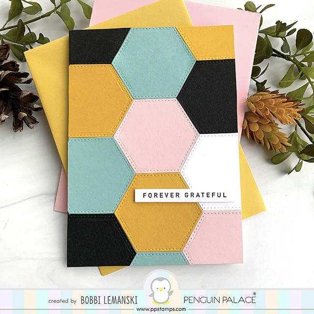
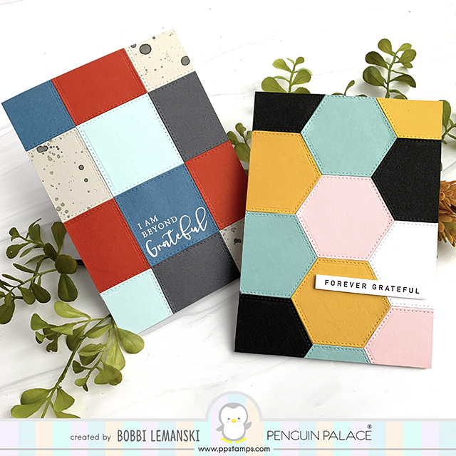
My first card uses the hexagon die from the the Warmest Wishes and Heartfelt Notes die set in the colors of gold, pink, a muted aqua and black. I love the opposing colors of the deep gold with the soft pink pastel. The black with the one white hexagon offers strong contrast, too. I am in LOVE with this color combo. 🙂
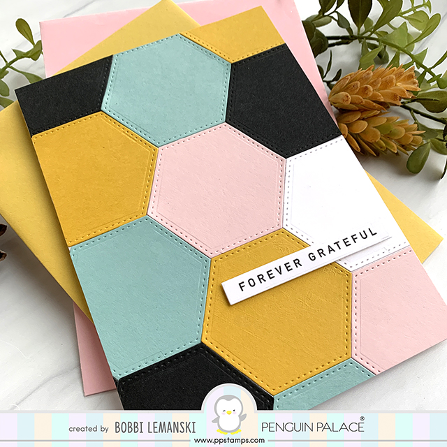
To make this 5″ X 7″ card, I die cut the stitched hexagons and adhered them to an A7 card base. The design is bold and beautiful.
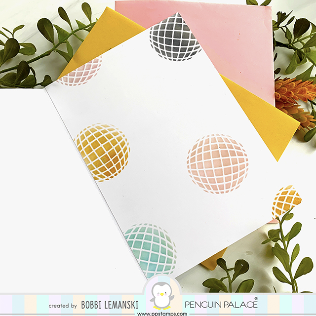
Inside the card, I used the Orbit Stencil to create a coordinating interior panel. A note of thanks can be written across the lightly colored orbit designs. I love when the interior panel coordinates with the front!
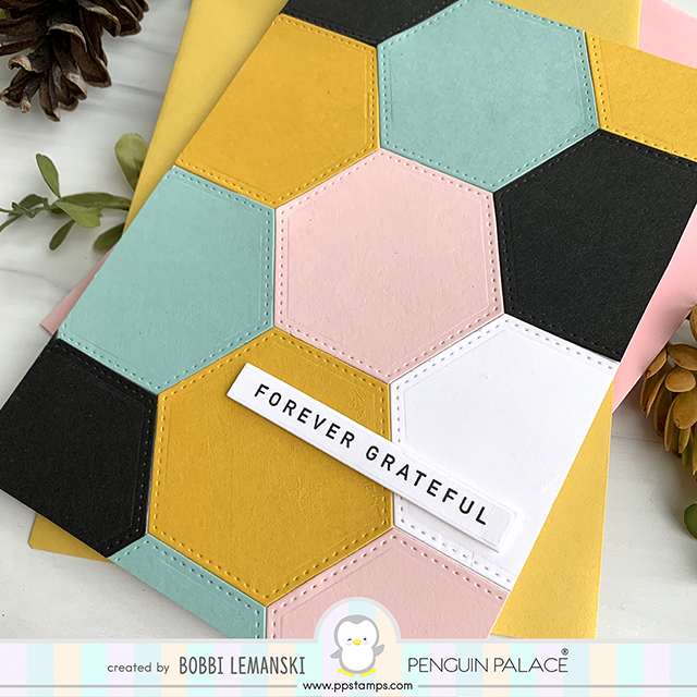
To complete this look, I stamped and cut the “Forever Grateful” phrase from the Heartfelt Notes stamp set and attached it using a piece of narrow foam tape so it pops from the page. I think the stitching around the shapes just elevates this whole look.
Beyond Grateful
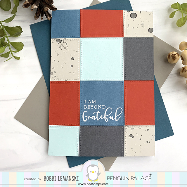
My next 5″ X 7″ card has a very masculine feel due to the color choices. I used a mix of rust, earthy blue, a warm gray, a light aqua and a light warm gray splattered with black watercolor paint. I used Kuretake Gansai Tambi Watercolor paint to create the splatters.
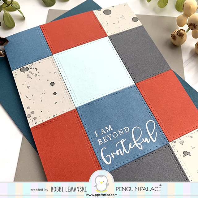
I made sure to add a darker color square in the lower center for the phrase so that I could emboss in white to make it stand out. The phrase is from the Heartfelt Notes stamp set.
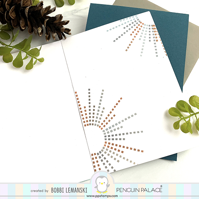
Inside the card, I used the Magical Fireworks Stencil to create a coordinating look using the colors from the front. I simply used a circle cutout, taped to the panel to use as a guide to rotate the stencil manually to make these fun designs. This one is as pretty inside as outside in my opinion.
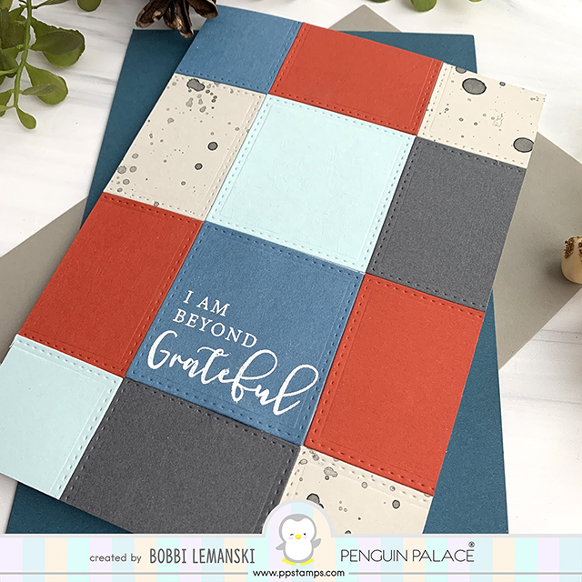
One last look of the second card. I think the mix of classic lettering with the script is so sharp with this modern design. Both cards are perfect for any person. They are easy to make, sharp looking and offer two looks – inside and outside in one card!
Thanks for stopping by today. If you want to see more ideas and inspiration from me, subscribe to my blog, BobbiHartDesign.com. I’ll send you updates on new posts! You can also find me on Instagram as @BobbiHartDesign and on Facebook as BobbiHartDesign. Bobbi Hartmann Lemanski, Bobbi Hart♥ Design, Adding h♥art into every design

