 Hello creative friends! Today, we are celebrating the Be Creative Release by Simon Says Stamp. There are prizes to win, a blog hop exclusive for FREE with a purchase, and loads of inspiration on the hop. All of the talented designers are listed below. You can start at Simon Says Stamp or here, at BobbiHartDesign.com and work your way through the hop’s designers. There’s so many fun ideas using the new products. Have fun!
FREEBIE! If you decide to place an order, use the code ART4U to get an exclusive Handcrafted With Love 3″ X 4″ stamp set FREE with any purchase (See details and exclusions to the left in the graphic.) Shop now here and use this code! This promotion expires 2/19/2023 at 11:59 pm EST.
WIN PRIZES! Leave a comment at each stop on the Blog Hop. Simon Says Stamp will pick one commenter from each stop to win a $25 coupon to use on a purchase! You have fifteen chances to win $25 to shop!!!!! How great is that?!
INSPIRATION! The Be Creative Blog Hop also offers lots of inspiration from 15 top designers in the industry including Debby Hughes, Caly Person, Suzy Plantamura, and more!
Now for some inspiration from me… I’ve made two 5″ X 7″ cards that both fit inside an A7 envelope. I’m using 80lb Neenah Solar White cardstock for the card bases and Canson XL Bristol watercolor paper (blue pad) for the card front panels. All of the watercoloring was done using Kuretake Gansai Tambi watercolors (48) Everything is stamped using Hero Arts Intense Black Ink. I use Simon Says Stamp Dot Runner Tape Adhesive to attach the elements together. Here’s the details for each one…
Confetti Acetate Window Card
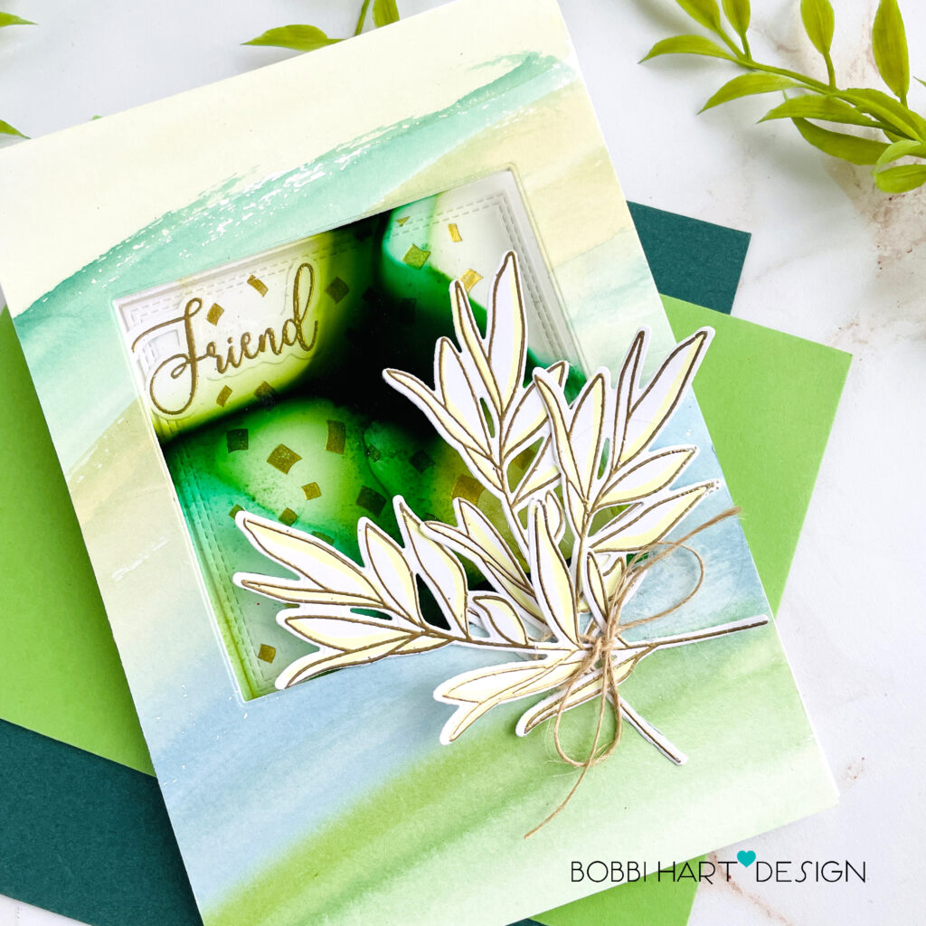
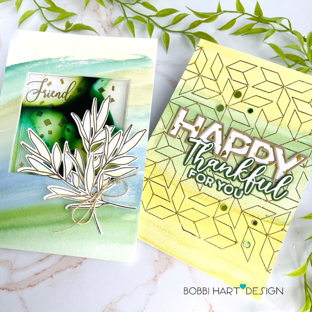
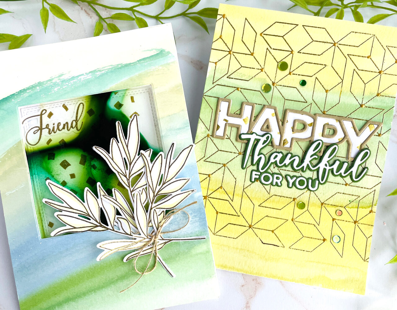
For my first 5″ X 7″ card, I am using the following new items from the latest release: Clear Acetate Sheets 20 pack and Slimline Falling Confetti Hot Foil Plate. I’m also using the Be Kind stamp and die set for this card. To make this card, I created color wash on the front panel in greens and blues using watercolor paint and Canson XL Bristol watercolor paper (blue pad). I cut out a stitched square from the watercolor panel and the card base. I like to stack them and then cut them out at the same to ensure they line up perfectly. Sandwiched between the base and front panel, I added a piece of the new acetate with an organic design. To create the fluid design on the acetate, I used Ranger Alcohol Inks in greens and yellows. I kept some areas clear to allow the confetti and the word “friend” to show through from inside. I love this “peek-through” look.
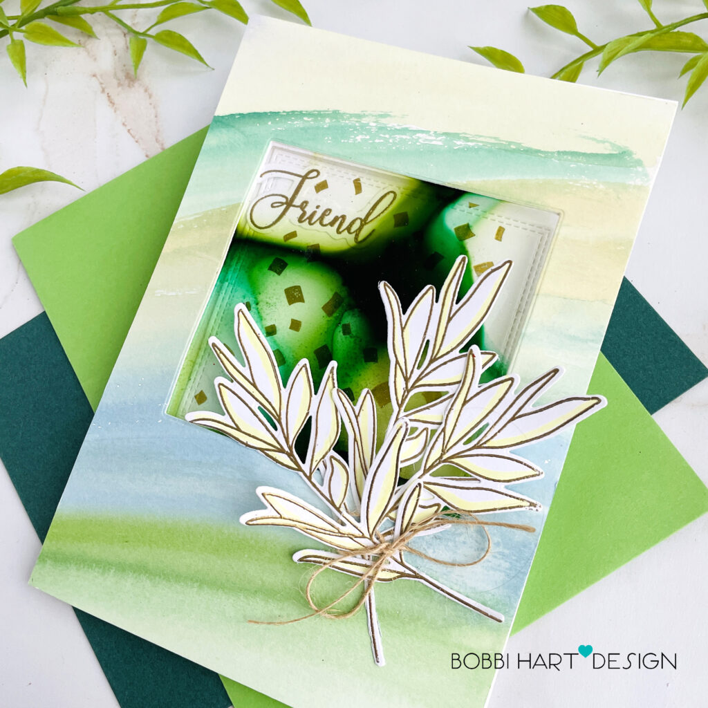
Once the acetate was in place, I embellished the front with three stems of greenery stamped in Versamark, embossed in gold metallic and cut from the Be Kind stamp and die set. I added just a bit of color to the leaves using a Copic Sketch Marker in YG00. It’s light, but adds just a little color. Hemp twine finishes the look.
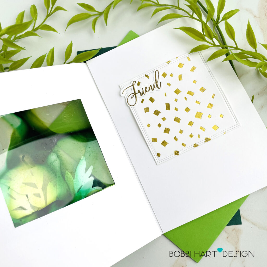
Inside the card, I added confetti and the word, “Friend,” both in metallic gold. I used Glimmer Gold Foil with the Slimline Falling Confetti Hot Foil Plate. Below the window and confetti, there’s room for a personal note or another sentiment, too!
Parallelogram Watercolor Card
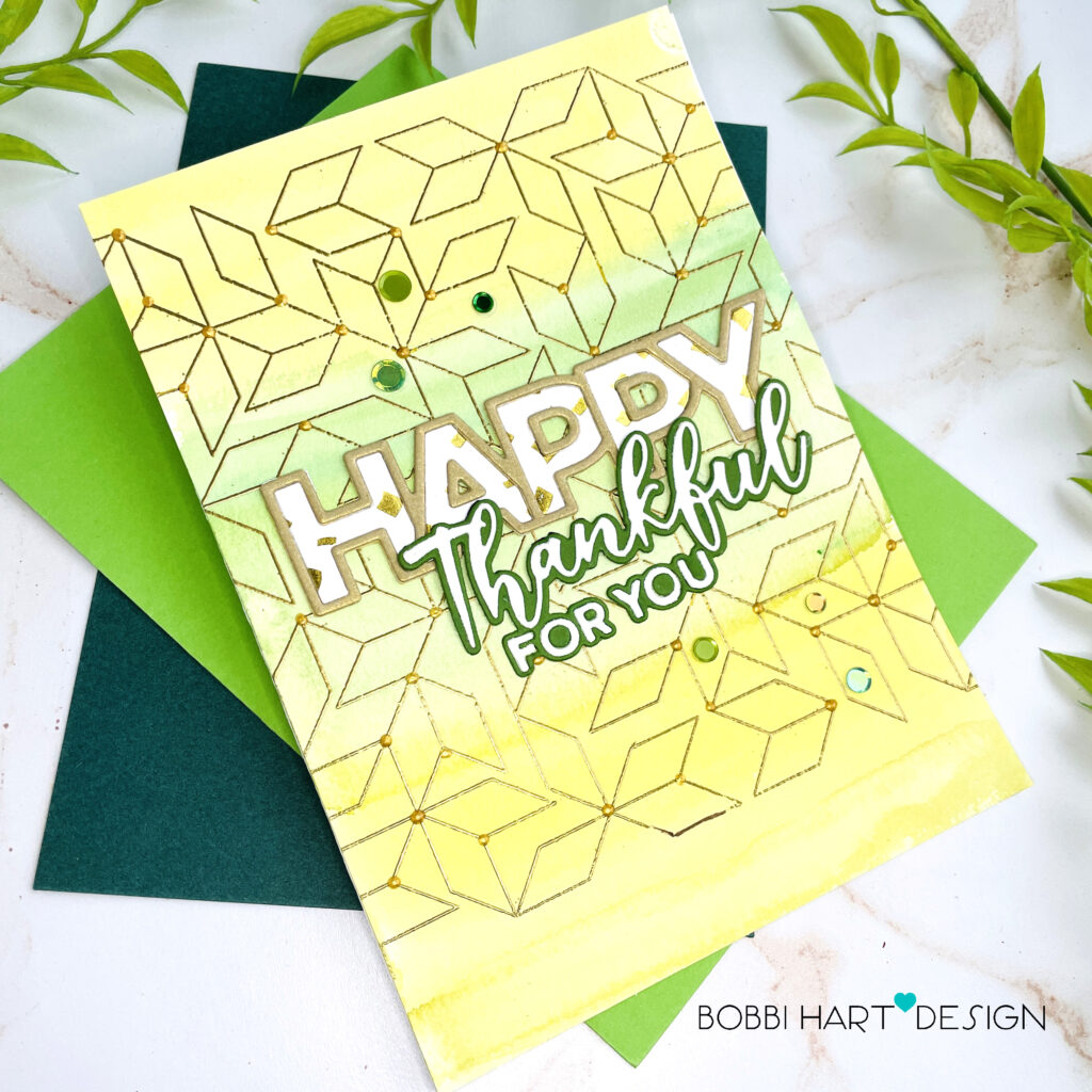
For my second card, I used the Slimline Falling Confetti Hot Foil Plate (gold on white) for the Chunky HAPPY letters and the new Parallelogram stamp for the background. I embossed the graphic design in gold metallic on a color wash of yellows and greens on watercolor paper.
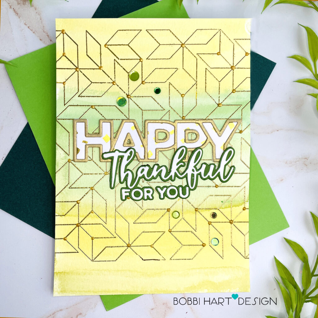
The green and white “Thankful for you” die cut was added below the “happy” sentiment. I used gold metallic Nuvo Drops on the line intersections for extra dimension and a few green-colored sequins for added sparkle.
You can shop the Be Creative release now! If you decide to place an order, please use the links in this post so that Simon Says Stamp knows what inspired you. I appreciate it very much. It helps me to continue to bring more ideas to you! Shop now!
Your next stop on the hop is the talented, Kath Stewart!
Thanks for stopping by today. If you want to see more ideas and inspiration from me, subscribe to my blog, BobbiHartDesign.com. I’ll send you updates on new posts! You can also find me on Instagram as @BobbiHartDesign and on Facebook as BobbiHartDesign.
Bobbi Hartmann Lemanski, Bobbi Hart♥ Design, Adding h♥art into every design
HOP ORDER:
Bobbi Lemanski ** YOU ARE HERE **
Kath Stewart ** NEXT HOP ON THE STOP **






Gorgeous cards. Amazing inspiration. Thank you.
Love the yellow & green Happy card! Made me smile!
The colors are very bright and springy.
The para card is great. I LOVE that stamp design/shapes. Really cool!
Wow! What great cards!
Love the bundled branches look.
These are so fun and unique! Beautiful job!
Great card designs, love them!
Both cards are so creative. The second one stand out and draws you in
Lovely work, Bobbi! That parallelogram stamp is rapidly finding its way to my shopping cart/basket.
Lori S in PA
Such cute cards! Thank you for the inspiration.
The cards are wonderful and I can’t wait to get some of the new acetate
Such pretty cards! LOVE love LOVE the colors you’ve chosen. The acetate is going to be a great new product to play with. Can’t wait to order some of it! Thanks for the inspiration! Love this release!
Wonderful artsy look.
Melissa
“Sunshine HoneyBee”
Oh, love your creations! I wasn’t sure how you did it when I was reading the instructions for the card with the acetate square, but then I saw the opened card and it all made sense! Thanks for sharing!
Your cards are both fantastic! Love them both!
Fabulous cards! I love the inked acetate technique.
Gorgeous designs! I LOVE the elegance!
Gorgeous Cards !
Wonderful cards. Love the geometric design
The acetate with the inking is great.
thanks for sharing.
So very beautiful!!! I love the colours you used!
Beautiful cards, love the window card.
Both cards are so creative. I love the surprise window and inside image of the first card. The colors of the second card are so warm!
Wish there was a video for the acetate card. Not sure why you cut the base out to. Cute idea
Lovely creations!
Thanks for sharing your fun cards!
These are unexpected and beautiful!
Absolutely lovely cards!😍
Love the foil on the cards!
Really great cards
Love your use of yellow in you cards! So fresh & pretty!
Your cards are beautiful.
Beautiful cards. I really love the first card.
Very creatively designed cards!
Gorgeous cards! I love the colors and the foiling!
Hello! I don’t use yellows in my card making very often but you have inspired me to try this beautiful blend. Thank you for sharing these beautiful cards💛
Your cards are both pretty and unique! I love the gold.
Your confetti window card is so cool!
Beautiful cards!!! The lovely colors remind me of Spring.
Oh my! I love the clear acetate window. Genius!
Love those cards, especially the first one. The acetate window design is so unique — absolutely gorgeous.
What fun cards. Love the geometric design.
Color choices are fantastic !
These cards are just beautiful! Thank you for sharing!
Beautiful cards! Love the Parallelogram!
Love what you did on the inside. Thanks for sharing your creativity.
Beautiful and stunning cards! Thank you for the inspiration today.
Wow! These cards are amazing. I love the creative ways you used the confetti hot foil plate.
The acetate window is truly lovely. I also am loving that brushstroke stencil in this release. Lots of goodies her and you used some of them very well. TFS
Both are beautiful. I can’t tell which I like better. I do love that parallelogram.
Very unique idea with the acetate.
Gorgeous cards!
Lovely cards. Different inspiration.
I like the green and yellow combo!
Great parallelogram card
These are wonderful!
Thanks for sharing.
wow – your cards are gorgeous – thanks for sharing
Beautiful cards
I love these – the colors are perfect.
Pretty cards! Thanks for sharing!
Your cards are lovely! I especially enjoy your colors !
Such beautiful cards, Bobbi! I love the new release from SSS and you have done them proud with your creations.
Beautiful cards! Love all the layers with the first card. Thanks for sharing your creativity with us.
So beautiful!
Gorgeous cards!! Love how bright the background colors are; reminds me of spring. Thank you for sharing!!
Love the colour combo, you created such an awesome cards!
What stunning cards! Love the gold embossing on both cards!
These are fantastic, love the designs and colour choices!
These are really Gorgeous!!!! I love the inked acetate panel!!!
I like the use of color wash on the cards.
Really amazing and awesome cards. I especially like the bright green card. Very cheerful!
Beautiful cards! Thank you so much for sharing.
Gorgeous cards! That first one is especially stunning.
I love what you did with the word HAPPY!
Love both cards. Very pretty colors and design.
Bright and cheerful cards anyone would be happy to receive!
Great to see these different takes on the stamps. I really like the pastel background and the way you used the acetate to create a window over the gold page, so clever. I am enjoying all of the ideas with this new release. Go SSS
Beautiful cards made with this great new release!
Great idea for a window card. Love it
The acetate card is very creative. The watercolored card is very pretty.
Beautiful and inspirational cards from this SSS release!!
Lovely cards with these new products!
Cool designs!
I just love all the ink layering and smooshing. These are beautiful cards!