
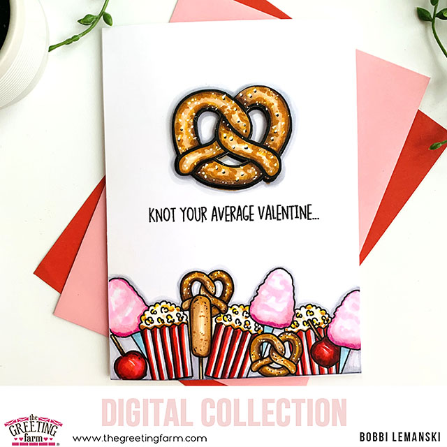
Hello, Friends! I’m back with another Valentine I created using the new Carnival digital set by The Greeting Farm. This time, I used the food items in the set to be my focal point. The digi sets are fun to use because each item can be sized differently to be a smaller accent or a larger feature. I wanted to make something different so I used the food as my feature! Take a look…
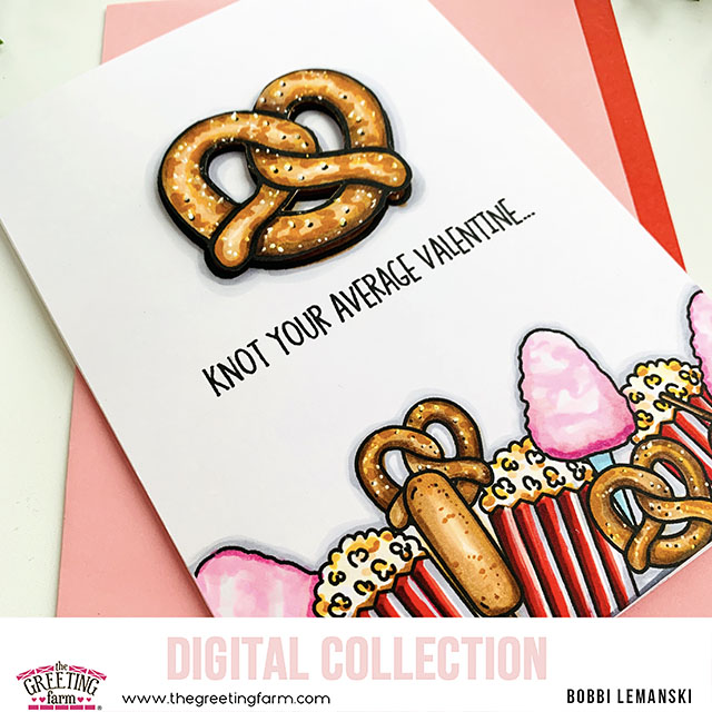
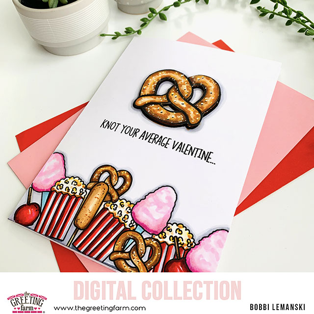
The star of the show is this fun, twisted pretzel that’s in the set. I made it large and used it on the top center of my 5″ X 7″ card. I then added the other yummy items to create a bottom border on the card front. I used the corn dog, popcorn, cotton candy and covered apples to create and pink/red visual at the bottom. I added in a few smaller pretzels, too. 🙂
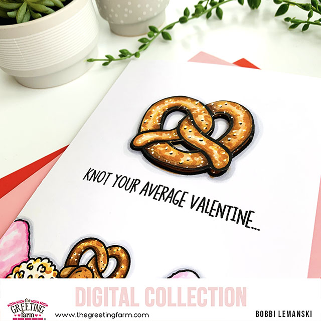
To make the pretzel, I printed another large one out on a separate sheet, fussy cut it and attached it using Scrapbook Adhesives White Foam Squares so it would stand out. I used 80lb Neenah Solar White cardstock the for A7-sized card base and card front panel. I always print my card front panel, color it and then attach to a separate card base. It conceals any ink bleed by layering them.
I used the following colors to color my yummy carnival snacks. I wanted this to have a lot of pink and red for Valentine’s Day and then the brown as a neutral. Here are the Copic Marker colors I used:
- Browns: E57, E55, E53, E50
- Reds: R89, R56, R46, R29, R17, R14
- Pinks: RV02, RV00, RV10
- Blues: BG00, BG000
- Yellows: Y21, Y18
- Gray shading: C3, C1
When I got done with my pretzel, I needed my pretzels to be more yellow so I also used some Y colors such Y21 and Y18 to get the golden look I was after. I wanted it to be brighter than just the E tones. I also added Y18 to the popcorn for the good butter! I also added white dots for salt on top using my Uni-bell Signo White Gel Pen. That really makes the pretzels come to life in my opinion. If you add a dot right above each black dot in the illustration, it gives the larger salt granules more dimension, too. 🙂
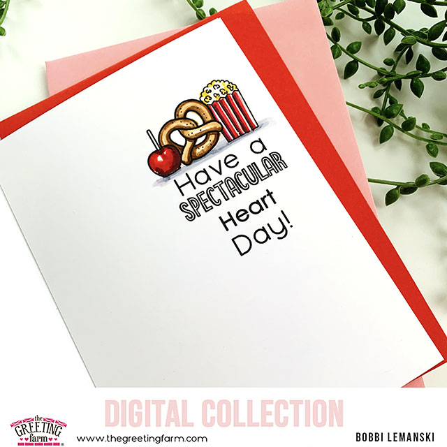
Inside the card, I designed the words and images and cut the 5″ X 7″ interior panel. I attached to the inside of my card base after I was done coloring it. When you use 80lb cardstock, doubling it on the card front and inside makes the card sturdier, yet light enough to send through the mail. I will be giving this card to my 18-year old, not-so-average, Valentine this year. It’s perfect for any age or sex. You know, it’s not too mushy!
For the phrases, I hand create the front panel line using a type font on my laptop. I used a digital phrase for the inside and then magically, using the powers of Photoshop, added the word, “heart” to it, too.
Thanks for stopping by today. If you want to see more ideas and inspiration from me, subscribe to my blog, BobbiHartDesign.com. I’ll send you updates on new posts! You can also find me on Instagram as @BobbiHartDesign and on Facebook as BobbiHartDesign.


